


Highlights
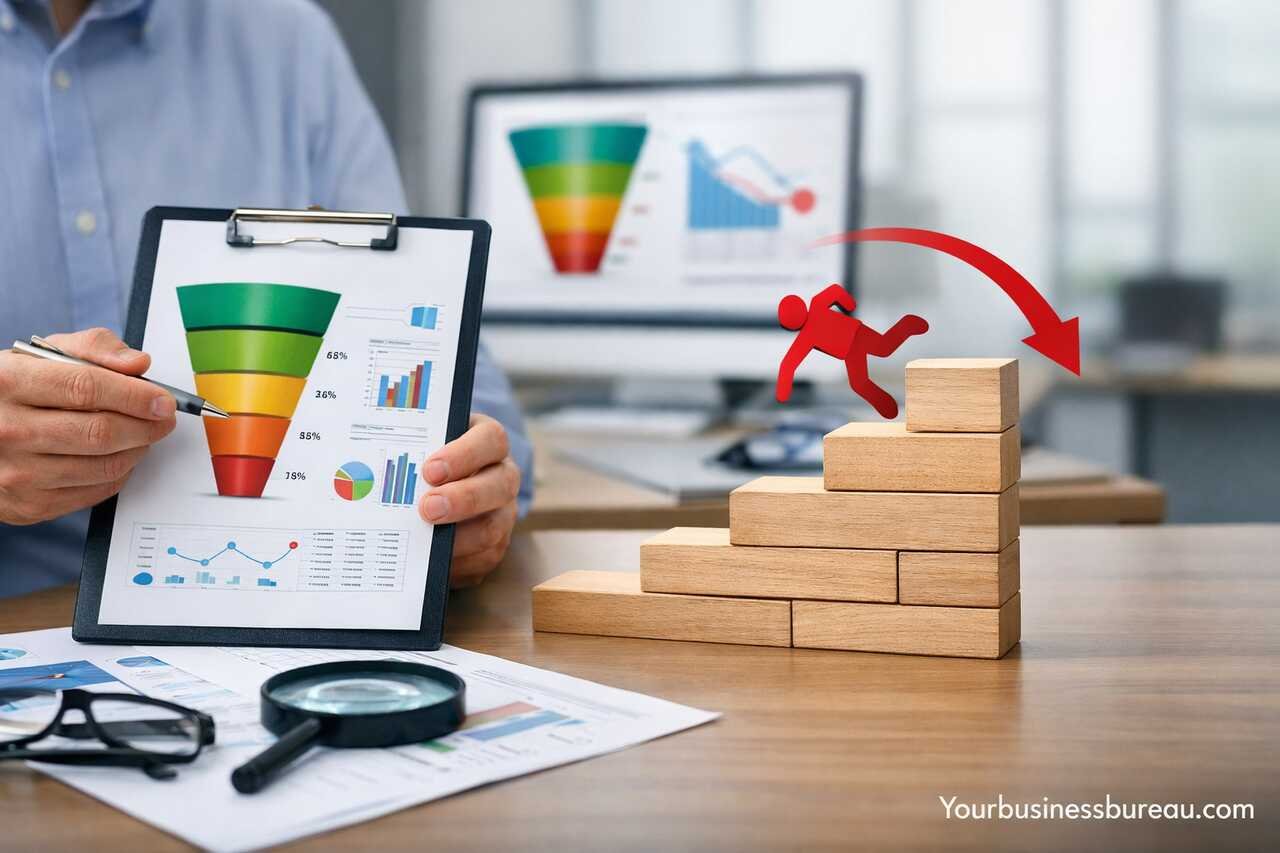
- A US eCommerce brand ran $10k in paid ads but saw low conversions. Users clicked but exited fast.
- I audited their funnel. The landing page didn’t match the ad promise. Users felt misled and dropped off.
- Forms asked for too much information. Checkout had only one payment method. Users abandoned mid-way.
- We simplified the form, aligned landing copy with ads, and added PayPal, Apple Pay, and guest checkout.
- Conversion rates jumped from 1.8% to 4.3% in three weeks. Funnel drop-offs dropped by over 40%.
- Businesses lose revenue not from lack of traffic, but from unclear messaging and poor funnel flow.
- Behavioral tools like Hotjar revealed where users struggled. A/B testing helped fix high-friction steps.
- Mobile users especially need fast, smooth, distraction-free funnels or they exit within seconds.
- Trust signals like testimonials, secure badges, and clear pricing improve user confidence and retention.
- Funnels should be redesigned around how users think, not around how companies want to sell.
Introduction
Funnel drop-off issues in US businesses represent one of the most common yet underestimated obstacles in digital growth and revenue optimization. When users enter a conversion funnel but fail to complete the desired action, businesses lose potential customers and revenue. From my experience working with multiple US-based companies across SaaS, eCommerce, and service sectors, the most significant drop-offs happen due to disconnects between user expectations and the funnel’s structure. Understanding the journey from awareness to conversion, and knowing where and why people leave, is essential for any business aiming to improve conversion rates, customer retention, and overall user experience. This article walks through the root causes, key points of analysis, and actionable fixes for this critical challenge.
Why Do Customers Abandon Funnels in US Businesses?
Many customers drop off due to a lack of trust, confusion in navigation, or friction during checkout or form submissions. From my consultations with US companies, the most frequent issue was misaligned messaging between ads and landing pages. Users feel misled and abandon instantly.
Technical errors also cause users to exit. Slow page load times, broken links, and non-responsive elements drive users away even when they initially had high purchase intent. US users, especially mobile users, expect seamless navigation and rapid feedback. Any glitch invites immediate exit.
Behavioral patterns indicate that users often leave when their informational needs are not met. Many US businesses focus too much on flashy offers rather than clarity and value. When users don’t quickly understand the product, pricing, or benefits, they choose competitors who communicate more effectively.
Mismatched User Expectations
Users enter funnels based on specific triggers, often ads, social media posts, or email links. When the landing page does not reflect the original promise, the result is cognitive dissonance. I’ve seen conversion rates double just by aligning ad copy and landing page headlines.
Technical Performance Issues
Lagging performance metrics such as page load time, unoptimized images, or JavaScript errors create an unprofessional experience. In several A/B tests I’ve conducted, improving load times by even one second reduced bounce rates significantly and increased funnel completion.
What Are the Most Common Drop-Off Points in the Funnel?
In most US businesses, the highest drop-off points occur at the form-filling stage, pricing page, and checkout. From firsthand analysis, the moment users encounter unexpected costs or complex steps, the exit rate spikes drastically.
The pricing section creates a mental barrier. If pricing is hidden behind sign-ups or lacks clarity, users hesitate. Many US consumers prefer knowing exact figures upfront and dislike hidden charges or subscription traps. Transparent pricing builds confidence and keeps users moving forward.
The final checkout step also triggers exits when payment options are limited, form fields are excessive, or errors are frequent. US consumers expect convenient options like Apple Pay, PayPal, or Klarna. Lack of such options feels outdated and deters conversions.
Form Abandonment Patterns
Overly long forms with irrelevant questions discourage users. Every unnecessary field adds friction. In my experience, reducing a form from 9 fields to 5 boosted completions by 37% for one US-based software client.
Payment Page Friction
Unclear refund policies, limited payment methods, and lack of trust indicators like SSL badges or money-back guarantees hurt trust. Visual reassurance, such as secure payment icons, creates confidence. Without them, drop-offs escalate right before purchase.
How Can US Businesses Analyze Funnel Drop-Off Metrics Effectively?


Tracking and segmenting funnel performance by user behavior, device, location, and referral source provides clear insights into where and why people leave. Relying only on surface-level analytics leads to incomplete conclusions.
From working with analytical platforms like GA4, Hotjar, and Mixpanel, I recommend looking at user flows, session recordings, and heatmaps. These tools reveal the exact interaction points that cause confusion or disinterest.
Custom funnel events also improve analysis. Tracking micro-conversions, such as clicks on product images or scroll depth, offers signals about intent. When paired with exit pages and session duration, businesses get a full picture of funnel health.
User Behavior Tracking
Heatmaps and session recordings offer visual cues about user frustration. If users hover too long on a button or rage-click an element, there’s a usability issue. Watching users interact in real time changed how I redesigned entire sales pages.
Micro-Conversion Metrics
Tracking smaller actions, like adding to cart or clicking “Learn More,” helps businesses detect where interest fades. When micro-conversions are high but final conversions are low, it indicates the bottom of the funnel needs improvement, not the top.
What Psychological Factors Contribute to Funnel Drop-Off?

Cognitive overload, decision fatigue, and lack of urgency are psychological drivers behind user drop-offs. Most users don’t consciously abandon, they feel overwhelmed or unconvinced, and leaving becomes the path of least resistance.
Trust gaps also form when businesses push too hard without addressing objections. In my direct experience consulting for B2B and B2C companies, soft-selling with trust signals outperforms aggressive call-to-actions almost every time.
Another common issue is the paradox of choice. When users face too many options, they hesitate. A streamlined offer, one product with clear benefits, increases clarity and reduces exit behavior.
Decision Fatigue Triggers
Too many buttons, distractions, or options require users to think harder. This mental effort backfires. I’ve seen higher conversions by limiting choices, simplifying navigation, and using step-by-step funnel designs.
Emotional Trust Signals
Bad design, outdated visuals, or inconsistent branding creates skepticism. Trust can be restored using consistent color palettes, real customer testimonials, and third-party validations like awards or certifications. These subtle signals often make the biggest difference.
How Can Businesses Fix Funnel Drop-Off Issues Permanently?
Solving funnel problems requires strategic design, user research, and iterative testing. One-time fixes don’t work, optimization is an ongoing process. Businesses should run frequent A/B tests and collect feedback at every step of the funnel.
Reworking funnel structure to mirror the user journey rather than the company’s sales agenda builds alignment. In one project, restructuring the homepage flow to reflect buyer intent rather than product features improved lead quality and volume.
Also, integrating chat support and exit-intent offers helps retain users in moments of doubt. These solutions act as digital safety nets, they catch the user before exit becomes a decision.
Conversion-Centered Redesigns
Every section of a funnel must support the user’s mental flow. From header clarity to footer navigation, aligning design with the user’s thought process boosts trust and engagement. I always recommend simplifying above-the-fold areas and guiding with visual cues.
Ongoing A/B Testing Strategy
Testing small elements like button text, placement, or imagery often reveals insights traditional analysis misses. I’ve worked with companies that grew conversion rates by 15–30% just by changing CTA placements and reducing cognitive distractions.
Which Tools Help Prevent Funnel Drop-Off in US Businesses?
Popular tools like Hotjar, Crazy Egg, and Microsoft Clarity provide visual behavior data. GA4 and Segment deliver real-time analytics with strong attribution. Using them together gives a holistic understanding of user intent and funnel effectiveness.
From my own audits, the winning combo includes a session recording tool, a heatmap platform, and a funnel analytics suite. Using all three offers clarity on what’s happening, why it’s happening, and where users give up.
Automation tools like Optimizely and VWO help implement A/B tests and personalization strategies. Personalizing content based on user behavior reduces bounce and increases time on page.
Behavior Analytics Platforms
Tools like Hotjar or Clarity track where users get stuck or confused. Watching real sessions reveals bottlenecks you can’t find in spreadsheets. These tools help translate data into actionable design changes that lead to measurable improvement.
Testing & Personalization Engines
A/B testing platforms allow teams to test variations without code changes. Personalization tools serve dynamic content based on traffic source, behavior, or geography, making each visit feel tailored. This has directly improved lead capture in my projects.
What Role Does Funnel Design Play in Reducing Drop-Off?
Design directly influences cognitive load, engagement, and flow. A funnel designed with user behavior in mind keeps attention focused and reduces confusion. Poor layout or inconsistent messaging leads users to question credibility.
Mobile-first design plays a major role in US businesses. Over 60% of funnel traffic is mobile, yet many companies still design desktop-first. I’ve seen mobile redesigns double engagement rates in multiple campaigns.
Clear headlines, strong visuals, and consistent CTAs reduce uncertainty and guide users toward action. Designing with intention, not decoration, improves focus and helps users complete tasks smoothly.
Mobile Optimization Techniques
Fast load speed, tap-friendly buttons, and minimized scrolling are key for mobile funnels. Implementing sticky CTAs and autofill features for mobile users reduces friction significantly, especially during checkout or sign-up.
Layout & Hierarchy Design
Users process pages top-down and left-right. Placing key value propositions early, and grouping similar actions visually, improves usability. A strong hierarchy reduces decision points and gently nudges the user toward the end goal.
High Drop-Off Areas and Solutions
| Funnel Stage | Common Drop-Off Cause | Recommended Fix |
| Landing Page | Mismatched messaging | Align ad copy with page content |
| Form Submission | Too many fields | Minimize input and use smart defaults |
| Pricing Page | Hidden or unclear pricing | Show full cost with no surprise charges |
| Checkout | Limited payment options | Offer diverse and secure payment methods |
| Confirmation Page | Lack of follow-up or next steps | Provide clear post-conversion direction |
Conclusion
Funnel drop-off issues in US businesses occur due to a blend of technical friction, poor messaging, behavioral misalignment, and lack of trust. Fixing these issues demands user-centric funnel design, ongoing testing, and behavioral insights. From my own consulting work, the most impactful changes often seem small but create a compound effect on funnel completion. A clear message, smooth interaction, and intentional design can significantly reduce exits and increase conversions. Businesses that prioritize user understanding will outperform those who focus only on traffic. Remember, it’s not how many people enter the funnel, it’s how many complete the journey.
If you want to explore how we help businesses grow from the ground up, you can visit yourbusinessbureau.com to see what we offer.
FAQ’s
US users leave quickly due to mismatched expectations, poor page load times, or confusing interfaces. Many are used to high-performing websites and abandon pages that feel clunky, slow, or unclear within seconds.
Use tools like GA4 or Hotjar to track user flows, clicks, and drop-off points. Look for stages with sudden declines in engagement and compare user behavior across devices and sources for a clearer picture.
Start with micro-optimizations like A/B testing headlines, forms, or CTAs. If drop-offs remain high, consider a structural redesign that aligns better with your user journey and sales narrative.
Yes. Small changes like CTA color, button placement, or headline wording can impact user flow significantly. In many of my projects, minor design shifts have led to double-digit conversion increases.
Absolutely. Personalization increases relevance and reduces bounce. When users see content that matches their intent, they are more likely to engage, trust, and convert.


